Measurely
An assistive kitchen device that guides people with limited mobility through baking — step by step."
My role: Product Design, Fabrication, CAD)
The Problem
Baking is deeply personal. For many people, it's how they show love, maintain tradition, and feel capable in their own home. But as mobility and coordination decline with age or illness, the kitchen becomes one of the first places that independence slips away, not because someone can't bake, but because the tools weren't designed with them in mind.
We saw this firsthand. Measuring cups require steady hands and sharp eyes. Recipes live on phones with small text, far from the counter. Scales, measuring spoons, and instructions are three separate things to manage at once — an overwhelming amount of coordination for someone whose hands shake, or who can only use one arm, or who tires quickly.
We talked to people across a range of abilities and kitchen experience levels. What we heard consistently: precise measurement is hard for everyone, and significantly harder when mobility is limited. Existing solutions didn't close that gap. The Thermomix does everything but costs thousands and wasn't designed for accessibility. Recipe apps are beautifully designed — for people who can tap a glass screen with floury hands. The Brava Oven is built for limited mobility, but it's an oven, not a measurement tool.
None of them answered the question we kept coming back to: how do you make the act of measuring ingredients, the most fundamental, repetitive part of baking, genuinely manageable for someone with limited hand strength or coordination?
That's what Measurely is built to answer.
The Problem
Part 1: Research & User Insight
Before we built anything, we needed to understand who we were building for. We interviewed people across a range of ages, abilities, and kitchen experience levels, from confident home bakers to people who'd largely stopped cooking due to physical limitations. The pattern that emerged was consistent: precise measurement is a pain point for almost everyone, and it's compounded significantly by limited mobility or coordination.
Holding a measuring cup steady while pouring. Leveling off a tablespoon of flour with one hand. Squinting at a recipe on a phone screen across the counter. These aren't edge cases, they're the core mechanics of baking, and they assume a level of dexterity that many people don't have.
A later usability survey pushed us toward a specific hardware decision. When we asked users how confident they were tapping a touchscreen with flour-covered hands, the answer was clear: not very. When given a choice between a screen-based "dispense" button and a large physical button mounted on the device, users overwhelmingly preferred the physical control — both for confidence and for reaction speed. That single finding shaped the button and screen interface that became central to Measurely's design.
Part 2: Dispensing Mechanism
VS
“Quote
from an
interview”
The hardest problem Measurely had to solve was also the most invisible to a user: how do you dispense a precise teaspoon of baking powder, automatically, from a compact countertop device?
Attempt 1: solenoid + rotating insert
Our first mechanism was inspired by a gumball machine: a rotating wheel with a fixed cavity that would capture exactly one unit of dry ingredient and drop it through. We paired it with a solenoid to drive the rotation. In testing, it failed. The friction forces from fine dry ingredients like baking soda overwhelmed the spring return, the mechanism jammed, and we couldn't get consistent output. This wasn't a fixable tweak. It was a fundamental mismatch between the physics of the mechanism and the physics of fine powder. We scrapped it and started over.
Attempt 2: Auger screw
We pivoted to an auger. It is a rotating screw that moves material along its thread, the same principle used in everything from meat grinders to industrial grain conveyors. Fabricated in-house and 3D printed in multiple iterations, the auger moved dry ingredients reliably without relying on springs or gravity alone. The mechanism worked. But "it works" isn't the same as "it's precise."
Calibration: from mechanism to measurement
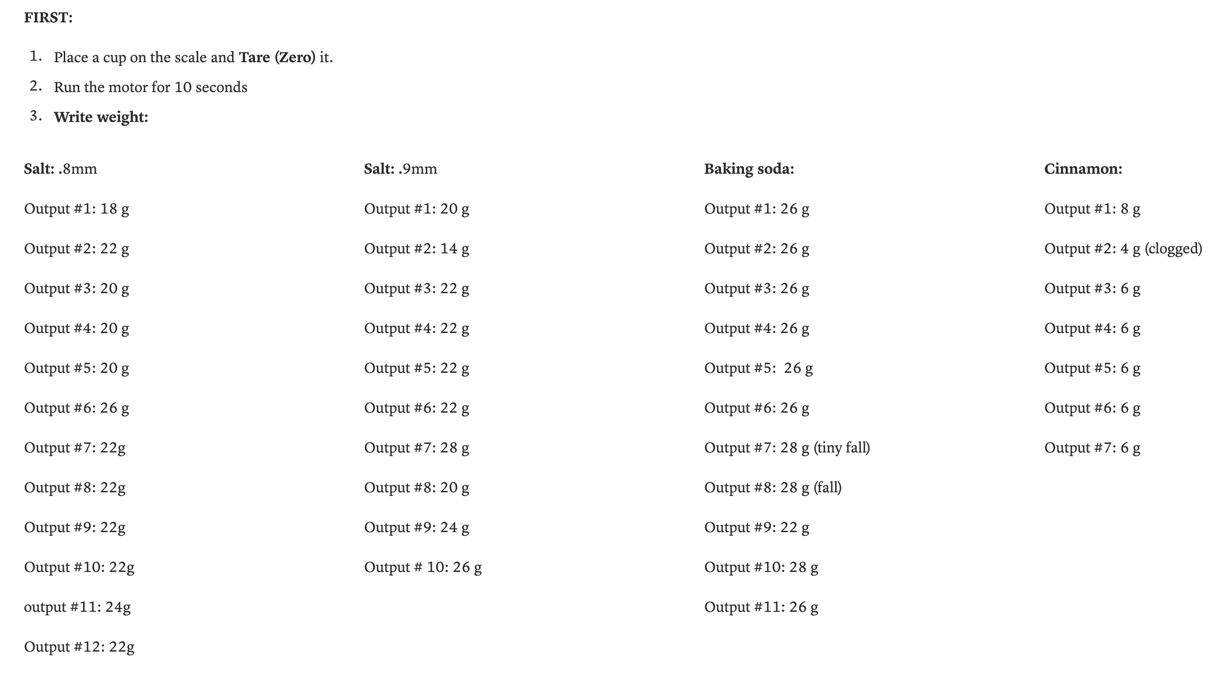
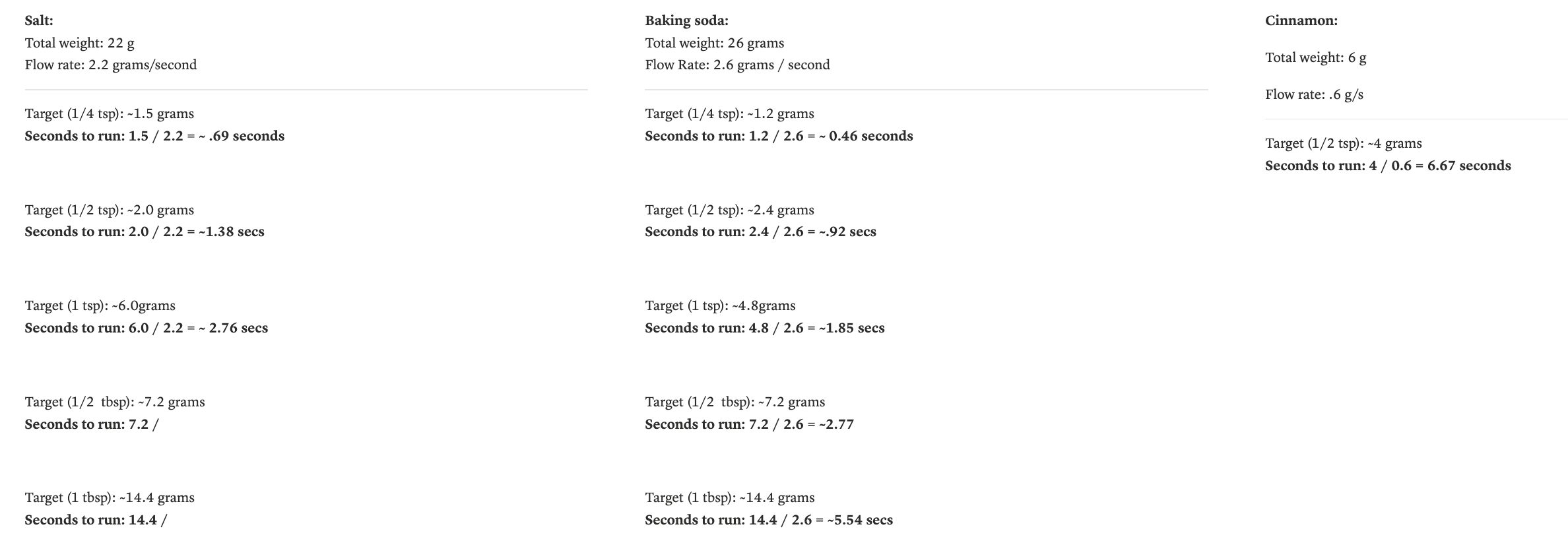
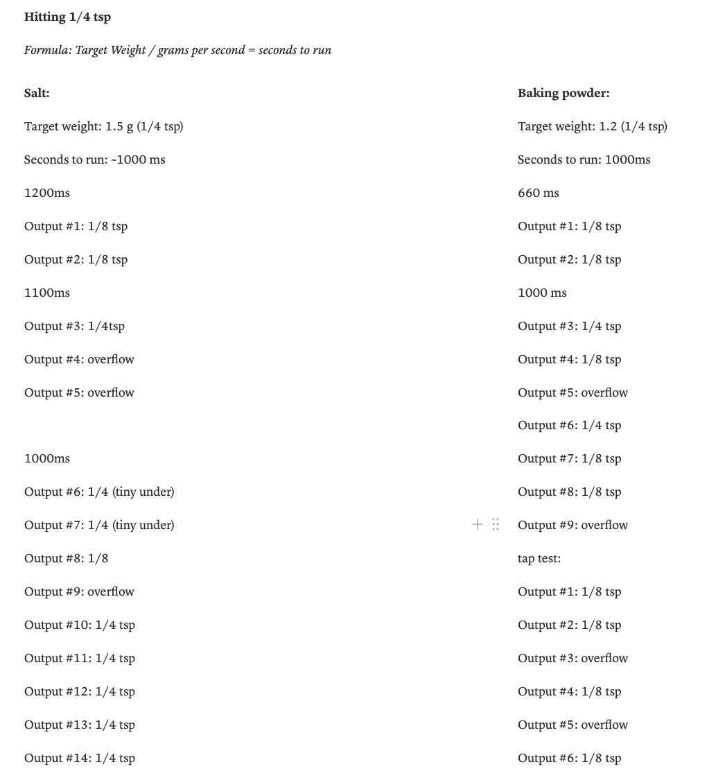
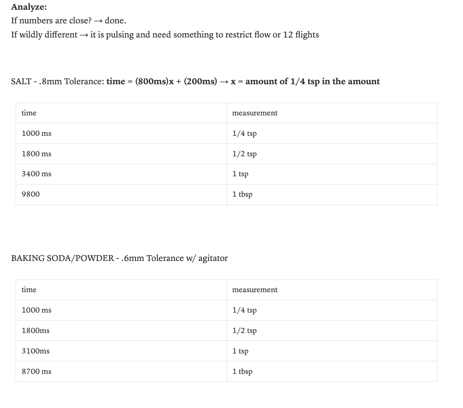
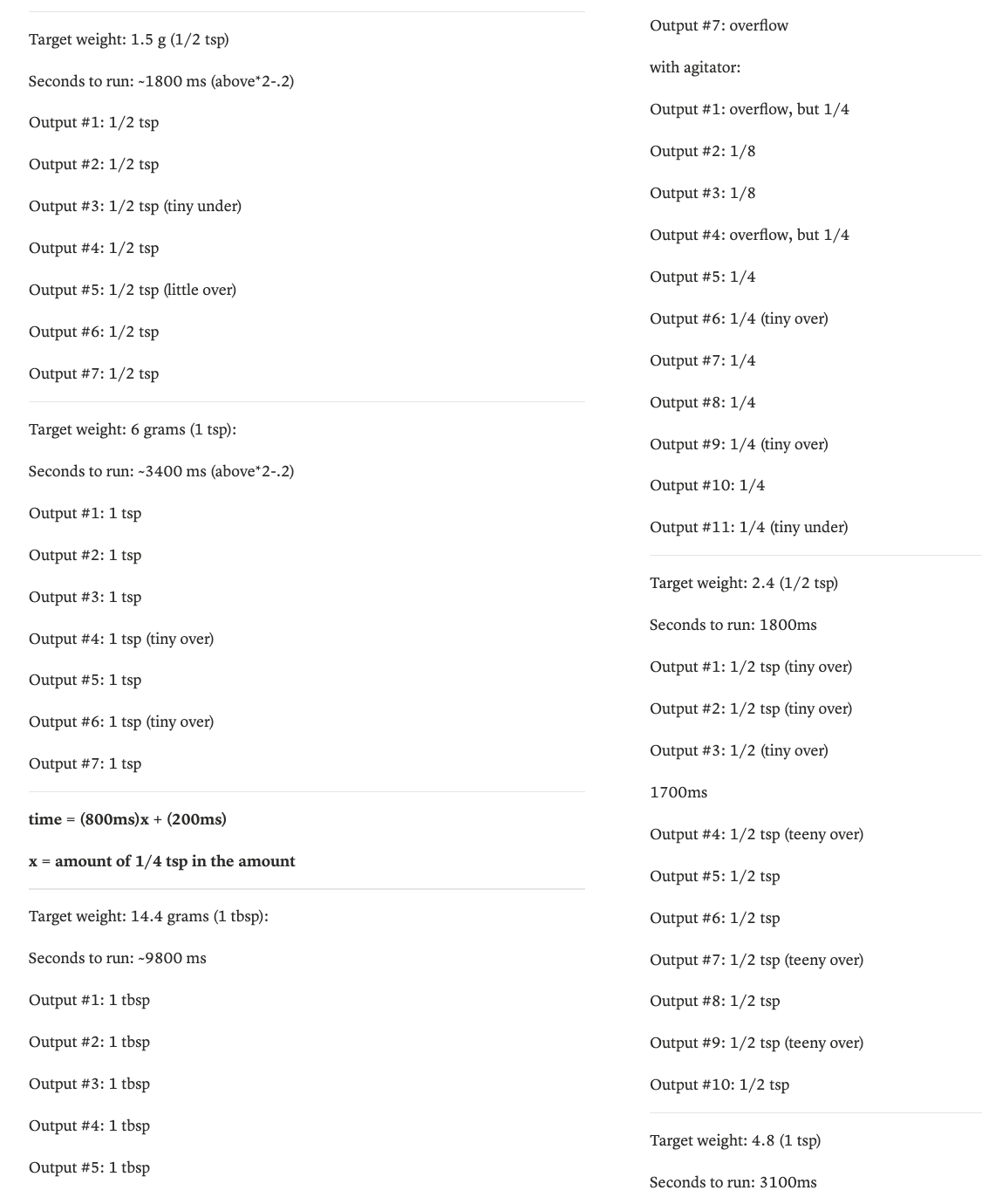
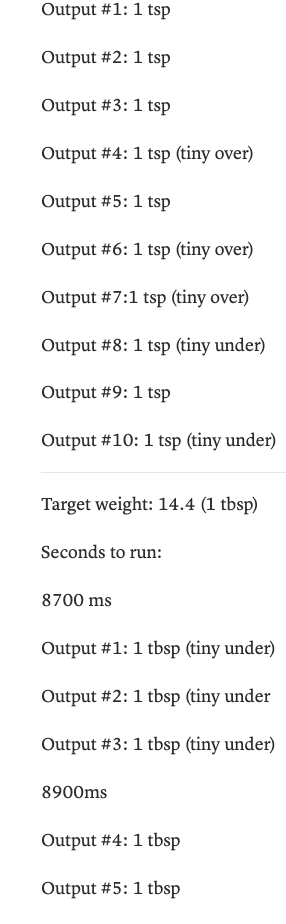
Getting from a working auger to a calibrated measuring tool required systematic testing. We ran trials across four ingredients — salt, baking soda, baking powder, and cinnamon — varying auger tolerance in increments of 0.1mm and motor run-time in increments of 100ms. After nearly 48 test variants and several hours of measurement, we derived a timing formula for each ingredient at each standard unit of measure, from ¼ teaspoon to 1 tablespoon. The result: dispensing accurate to within a quarter teaspoon, repeatably, at the press of a button.
Part 3: Physical UX & Enclosure Design
A device for people with limited mobility has to earn trust before someone picks it up. That meant every physical decision (material, weight, height, layout, surface texture) needed to be intentional.
Materials
We tested candidate materials for three things: food safety, cleanability, and weight. Surfaces were soiled with flour, oil, and water, then cleaned with a paper towel and sponge, and evaluated for residue. Stainless steel bowls cleaned completely and added structural stability. Wood required sealing but offered warmth and approachability — important qualities for a device meant to feel like part of a kitchen, not a piece of medical equipment. We landed on a sealed plywood enclosure with stainless contact surfaces, keeping the device light enough to move but grounded enough to feel stable in use.
Form & layout
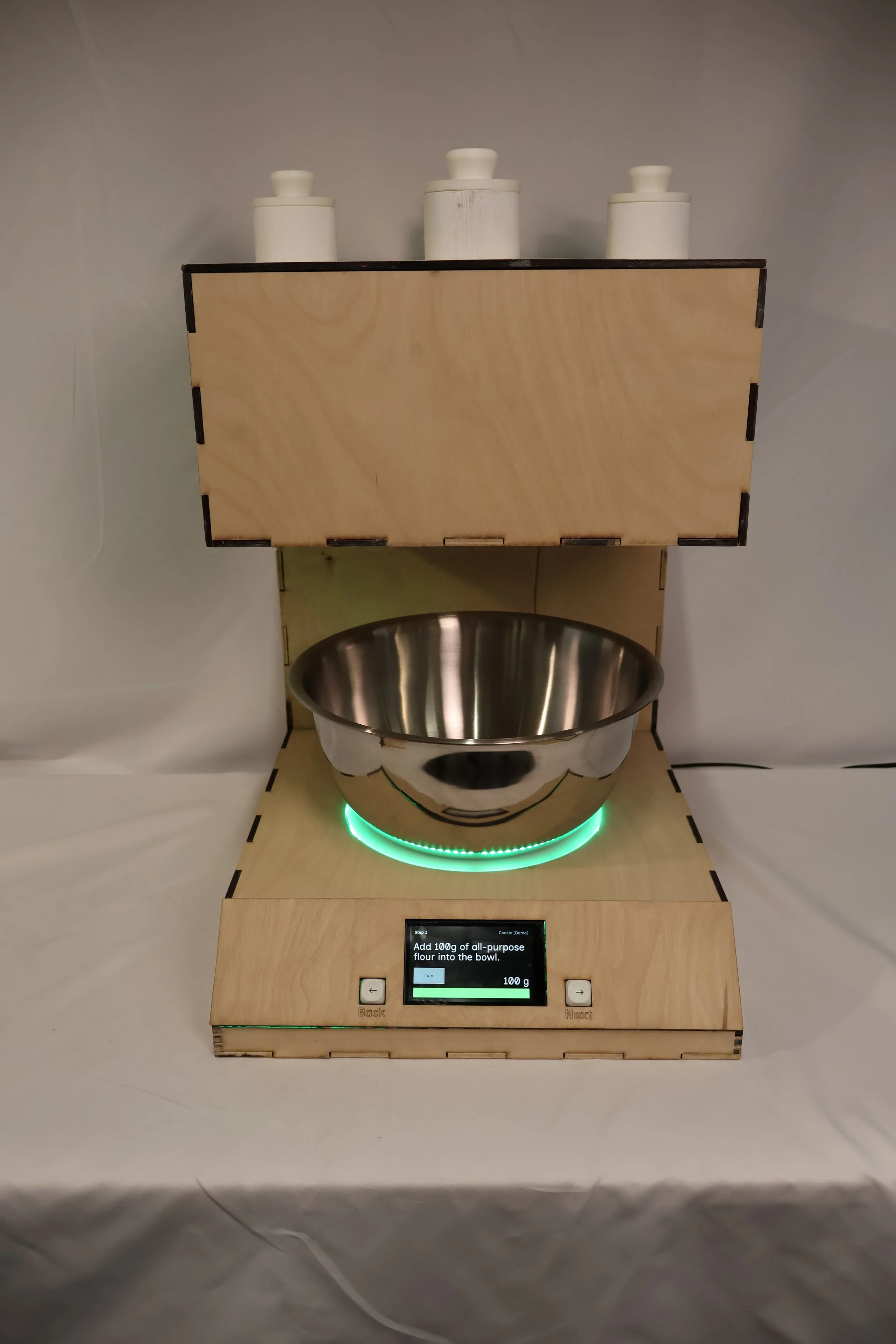
The two-tier form emerged from the user journey. The lower deck houses two bowls — one for dry ingredients, one for wet — positioned side by side so users never have to move them far. The upper deck holds the dispensing mechanism directly above, so ingredients fall straight down with no pouring required. The screen and control knob sit at the front of the lower deck, angled for visibility from a standing or seated position. Every spatial decision was made around minimizing the number of times a user has to pick something up, reposition, or reach.
The touchscreen decision
Early prototypes explored a physical knob as the primary control, an appealing choice for users with limited hand precision, since it requires no fine grip and gives tactile feedback. In practice, we couldn't source electronics with sufficient documentation to implement it reliably within our timeline. We made the call to commit fully to a touchscreen interface instead.
That constraint pushed us to think harder about touchscreen accessibility. We designed large, high-contrast tap targets, kept each screen to a single action, and ensured no step required more than one interaction before advancing. The result is an interface that works with a knuckle, a single extended finger, or a light tap, and that tradeoff, while born from a practical limitation, reinforced something our user research had already suggested: clarity of interface matters more than modality.
Part 3: Physical UX & Enclosure Design
While the physical device took shape in the lab, a parallel design process was building the brain behind it. Sam led UX design, programming, and the web application that handles recipe browsing and management. Working from early low-fidelity wireframes sketched during our first weeks of research, the interface evolved into a guided step-by-step recipe experience — displaying one instruction at a time, with real-time scale feedback and auto-dispense triggers built into each step.
My contribution to this subsystem was at the intersection of physical and digital: defining what the screen needed to communicate at each moment in the user journey, and ensuring that the on-device interface matched the physical controls we'd designed. The knob navigates between steps. The screen confirms the action. Dispensing is triggered physically, not through glass. That coordination between hardware and software UX was a continuous back-and-forth throughout the semester, and getting it right required both of us understanding each other's constraints.
The Result
Measurely launched at the April 2026 ATLAS EXPO as a fully functional prototype. A user can walk up to the device, select a recipe, and be guided through every measurement step — dry ingredients dispensed automatically, scale feedback in real time, instructions one step at a time on screen — without needing to read a separate recipe, handle a measuring cup, or manage more than one thing at a time.
The dispensing mechanism handles four dry ingredients — salt, baking soda, baking powder, and cinnamon — at standard baking measurements from ¼ teaspoon to 1 tablespoon, accurate to within a quarter teaspoon. The-bowl layout keeps wet and dry separation built into the physical setup, removing one more decision from the user's hands. The guided step-by-step interface means someone can pause, take a break, and come back without losing their place.
It's not a finished product. But it's a working one — and it does what we set out to do.
Reflections
This project taught me that the hardest part of building something physical isn't any individual problem — it's the relentlessness of the iteration. Something that works on Monday breaks on Wednesday when you change one variable. A mechanism that passes a test in isolation fails when it meets real flour. You develop a kind of tolerance for that, and then eventually a rhythm: test, observe, adjust, repeat. By the end of the semester that rhythm felt natural. At the beginning it felt like failure.
The pivot from solenoid to auger in week three was the moment that defined how I approached the rest of the project. We didn't abandon the solenoid because we gave up — we abandoned it because the testing told us something true, and we listened. Learning to treat a failed test as information rather than a setback was the most transferable thing I took out of this semester.
I also learned that physical UX is unforgiving in ways that screen UX isn't. A button on a screen can be moved in ten minutes. A hole in a wood enclosure cannot. Every spatial decision carries real consequence, and that pressure made me a more deliberate designer — more likely to sketch and model before committing, more likely to ask whether a decision serves the user or just solves an engineering problem.
Working across disciplines with Sophie and Sam reinforced something I already believed: the best outcomes happen at the edges between roles. The knob-vs-touchscreen debate, the bowl layout, the height of the dispensing outlet — none of those decisions belonged cleanly to mechanical, electrical, or UX. They required all three of us, and they were better for it.
Next steps
Food-safe materials The current prototype uses PLA plastic for the auger and dispensing components. A production version would require food-grade alternatives — stainless steel or food-safe nylon — to meet safety standards and withstand repeated washing. This was a known limitation from early in the semester; the materials testing we did informed what the right answer looks like, even if we couldn't get there in this iteration.
Liquid measurement We scoped out liquid measurement mid-semester to keep the project achievable. The architecture already accounts for it — the lower deck has space for a second hopper — but implementing it reliably within our timeline wasn't feasible. It remains the most meaningful feature addition for a next version.
Expanded recipe library & web app integration Sam built the foundation for a web application that lets users browse and load recipes onto the device. The next step is building that out into a fuller library, and eventually allowing users to input their own recipes — making Measurely useful beyond the handful of baked goods we had time to program.
A note on who this is for: We built Measurely with older adults and people with limited mobility in mind, but the people who responded most enthusiastically at EXPO weren't always in that group. Beginner bakers, people managing kitchen anxiety, anyone who's ever over-salted something because they eyeballed it — the device resonated more broadly than we expected. A next version would be worth designing for that wider audience without losing the accessibility-first thinking that shaped everything else.