Cheyenne Mountain Zoo Website Redesign
Timeline: 3 months (September – December 2025)
Class: ATLS 4620 – User experience 1
INTRODUCTION
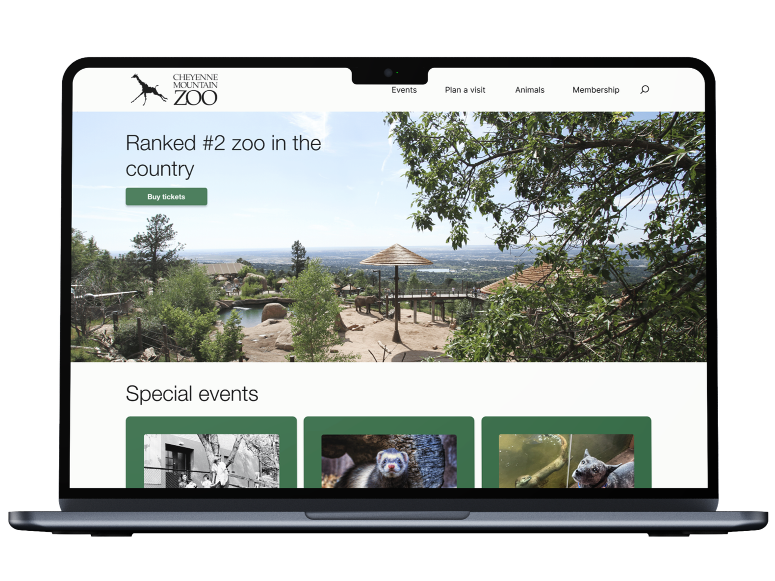
This project was a redesign of the Cheyenne Mountain Zoo ticketing experience. The current ticketing experience is outdated, repetitive, and confusing. As part of a class assignment, I took on, and succeeded in, the challenge of redesigning the ticketing experience to improve user satisfaction and overall experience. The redesign resulted in a more efficient ticket flow that reduces user confusion.
Summary
During this semester-long project, I was the sole designer and researcher responsible for implementing the website redesign.
Role
The main problem in this project was managing the amount of information – i.e. policies, special days, general zoo information, opening and closing times, etc. – the original website provided, and figuring out how to best get that across without overwhelming the user. Similarly, how to make the ticketing experience as efficient as possible without cutting out necessary steps.
Challenge
RESEARCH
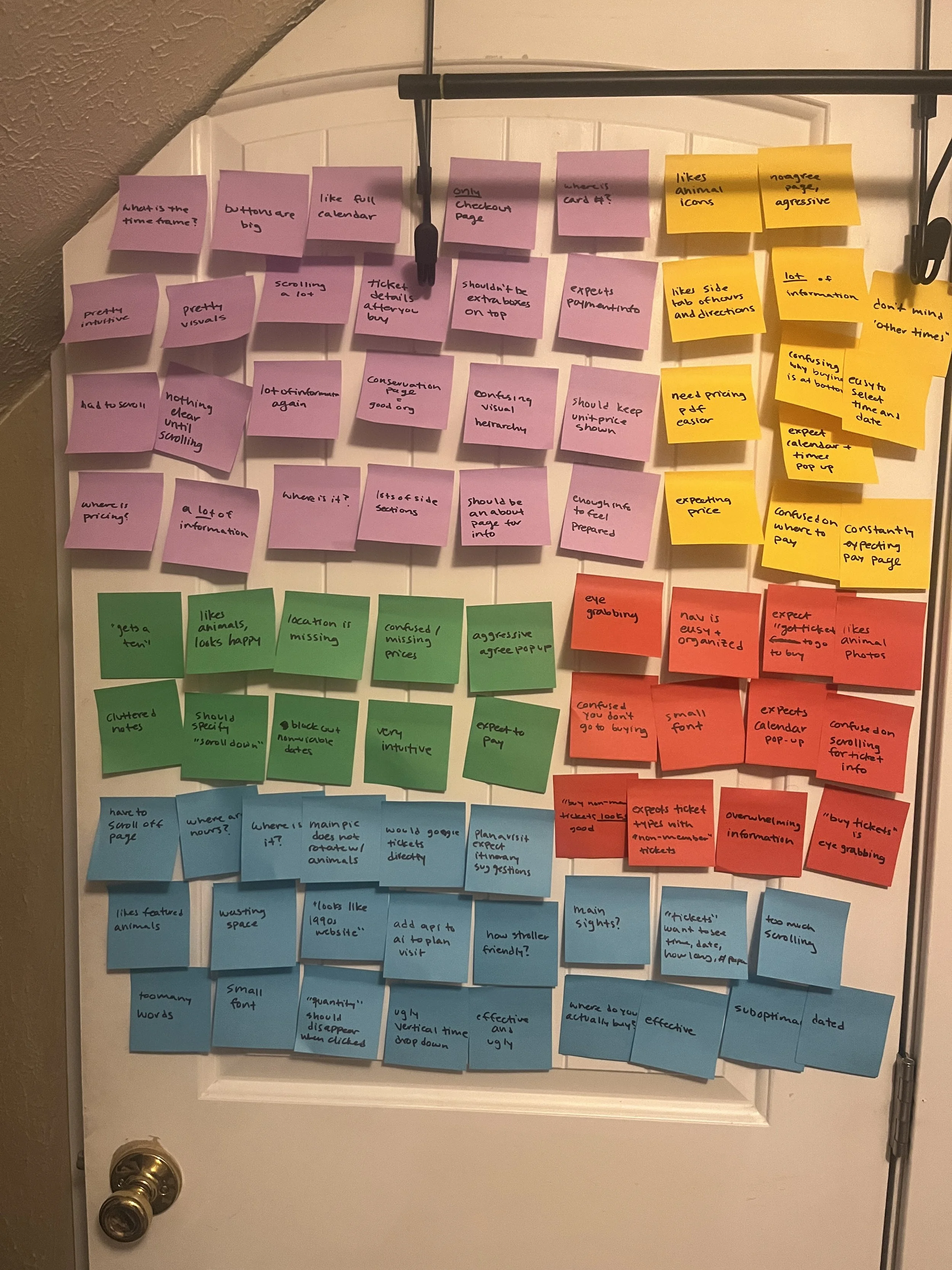
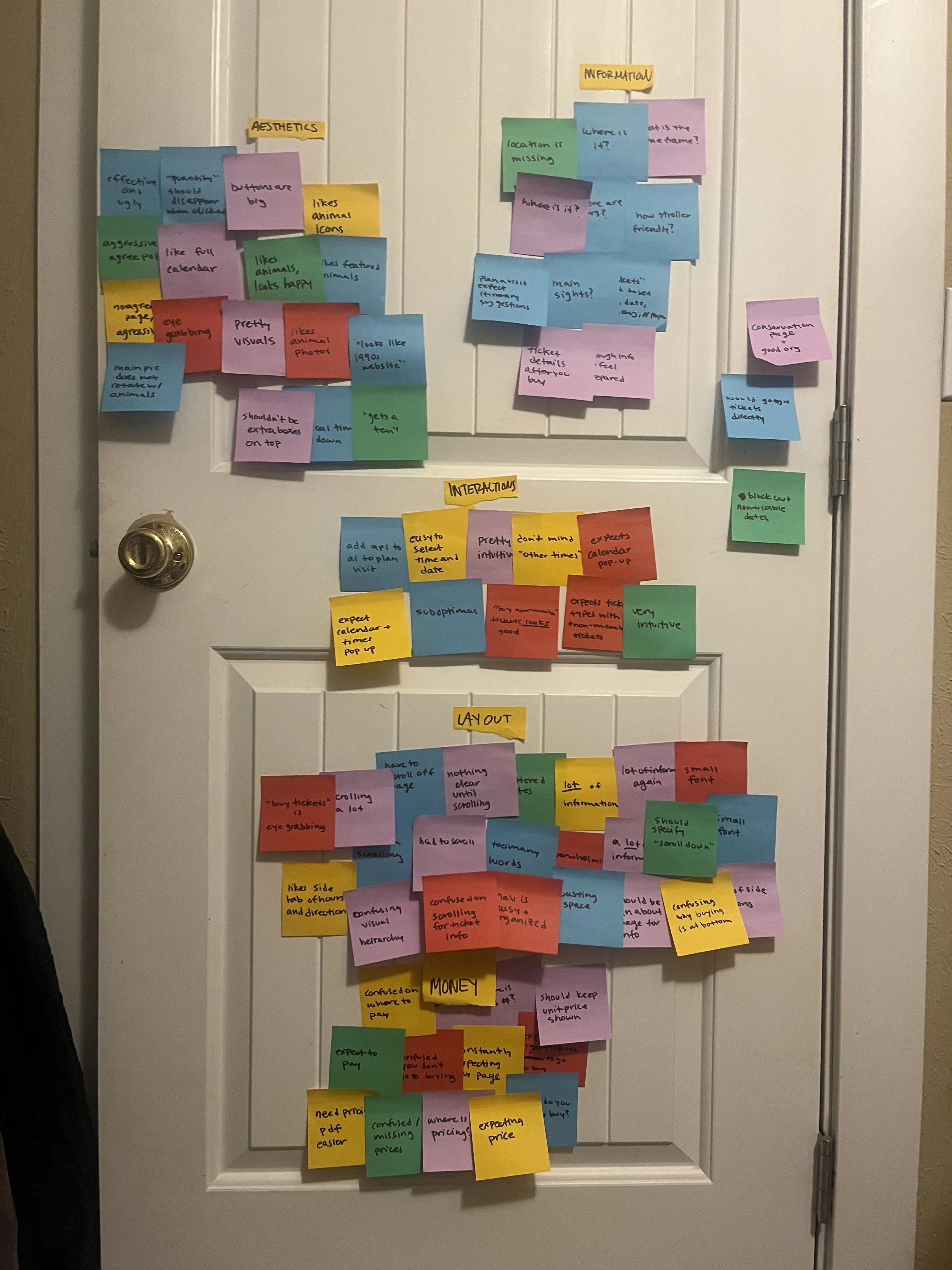
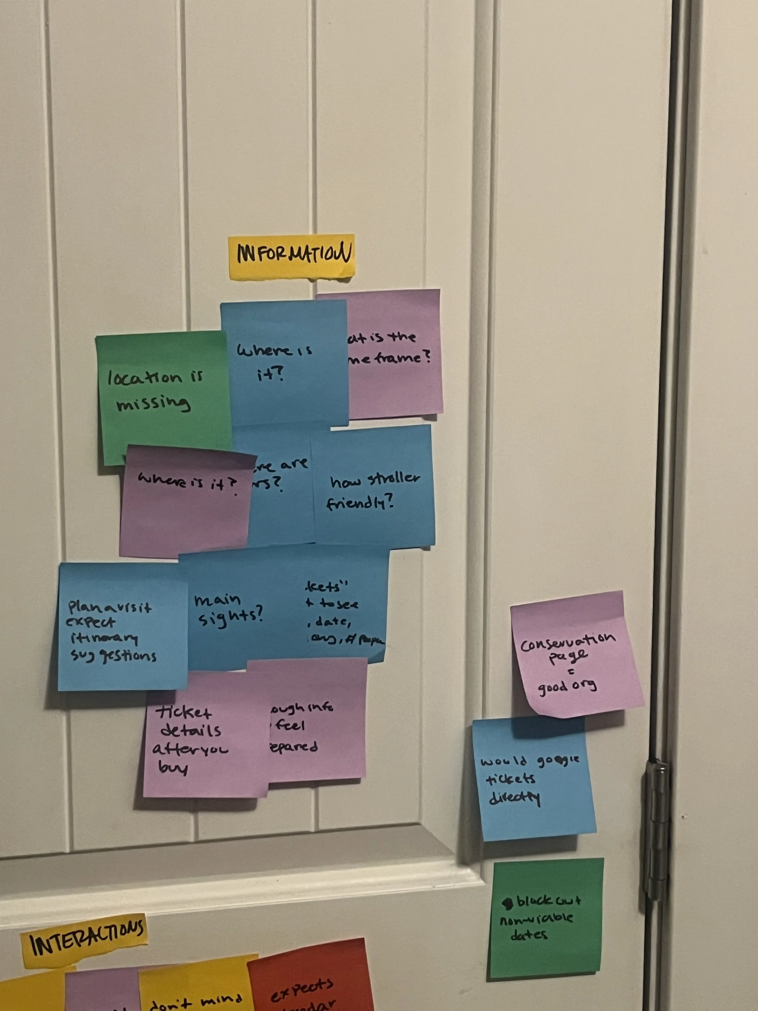
In order to figure out the best way to improve the experience, we conducted user interviews, did affinity mapping, and created “how might we” statements.” Throughout this testing, I uncovered multiple pain points, including: overload of information, confusing visual hierarchy, price information discrepancies, too much scrolling, and more. These pain points revealed opportunities to prioritize important information, create a direct ticket flow, and make pricing most transparent from the start.
Usability testing of current experience:
Affinity mapping
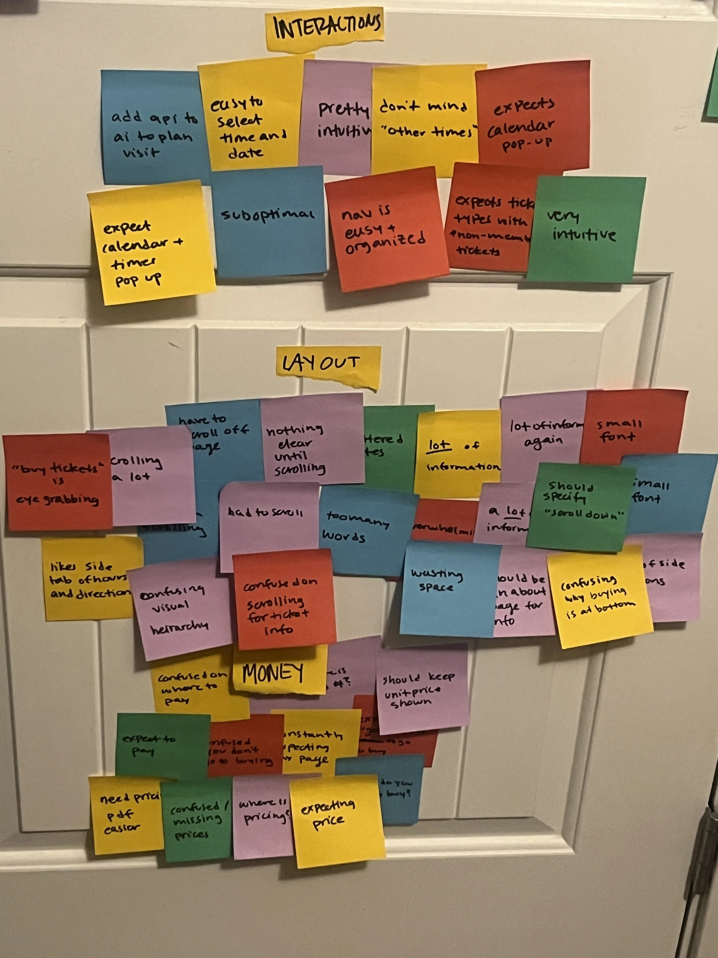
How might we…
speak to making the ticket flow more efficient?
User notes
“looks like a late 1990s website”
“I could have programmed this website, me, not a programmer, better”
“words are death of a website”
“barely effective and extremely suboptimal”
DESIGN
Zoo visitors buying online tickets need an efficient process to buy tickets because the current process is long and discourages people from completing their purchase.
Problem statement

For the task flow, I used user feedback and affinity mapping to evaluate what information to prioritize and what information could be secondary. Based on that, I proposed the following task flow:
Task flow
Old
New
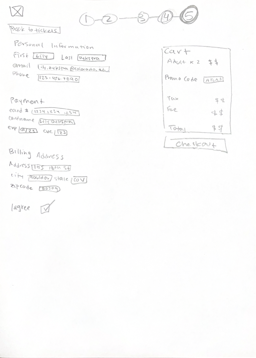
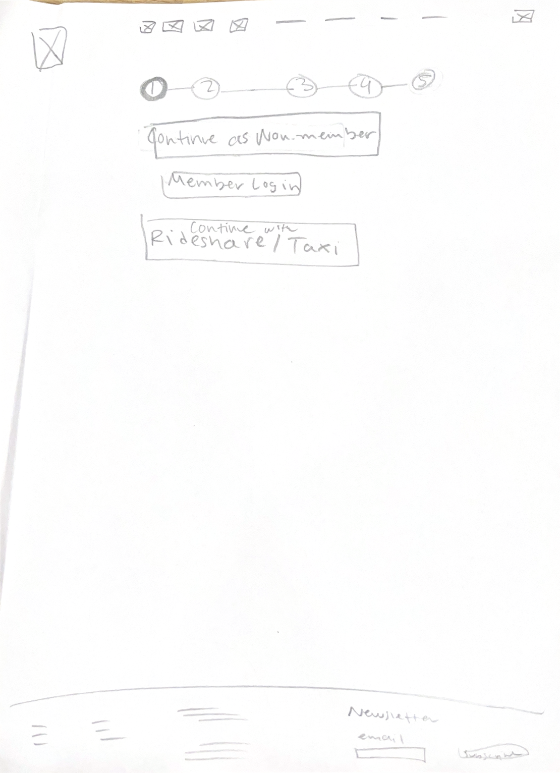
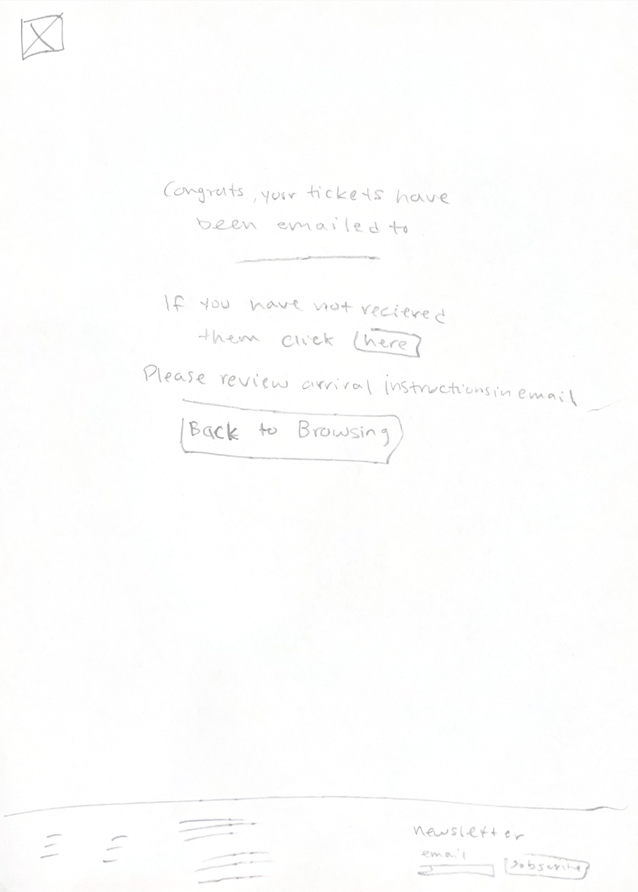
For low fidelity, I sketched out my proposed task flow. My main changes were cutting down on unnecessary front page information. I redesigned the home page, prioritizing zoo promotion and their schedule. I also reduced the amount of pages it takes to get to buying tickets.
Low fidelity wireframes
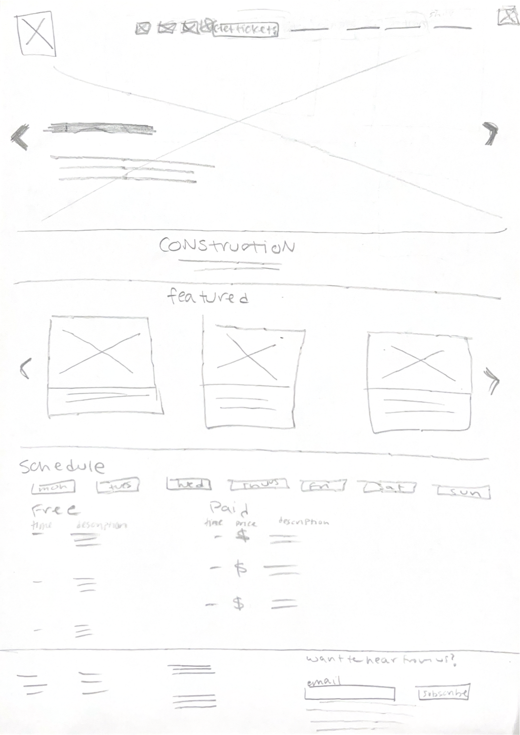
Home
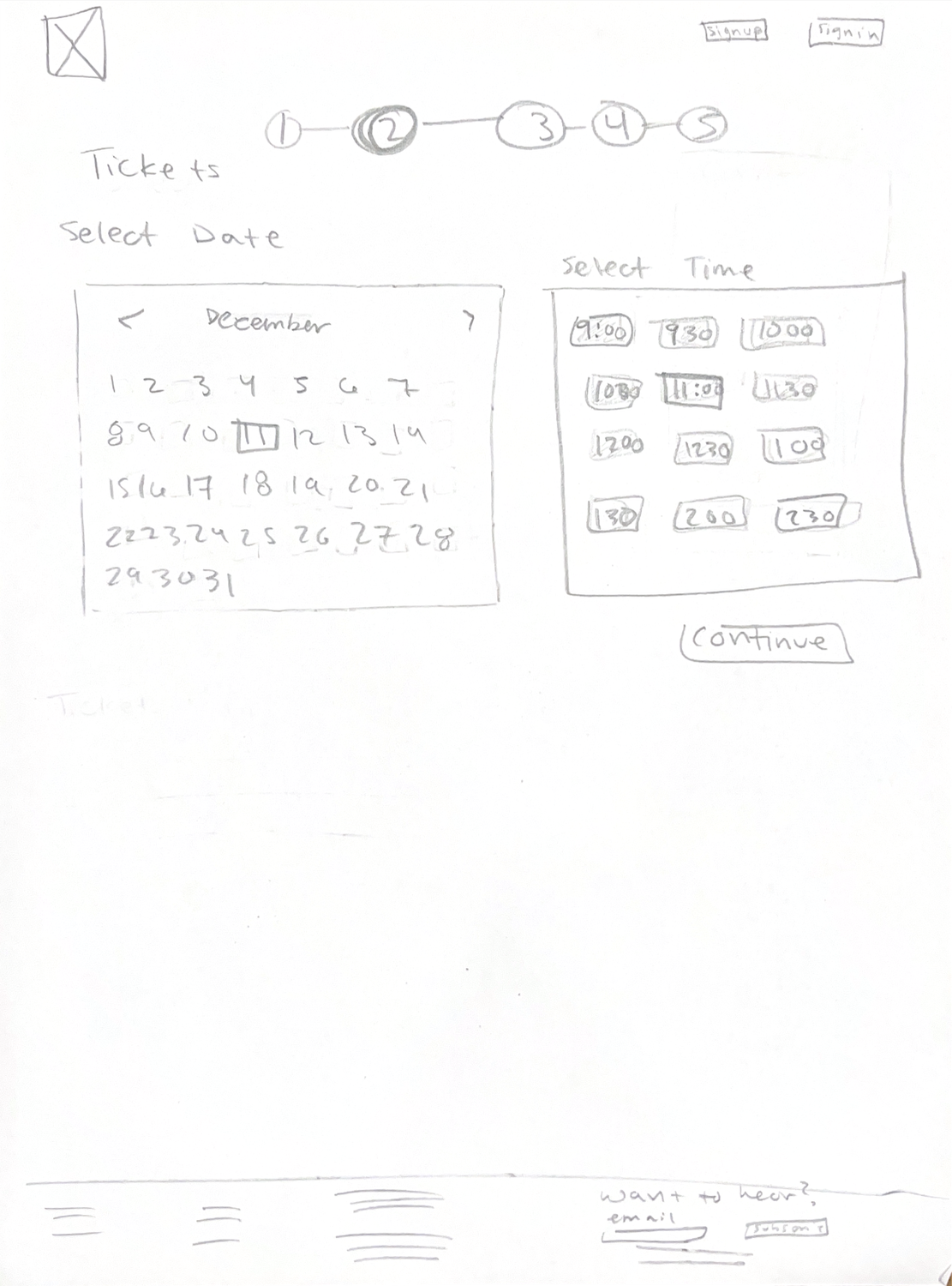
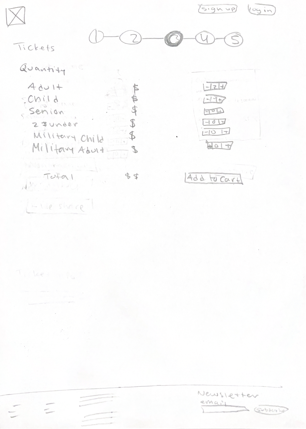
Quantity
Date and time
Ticket type
Personal information
Confirmation
Mid fidelity wireframes
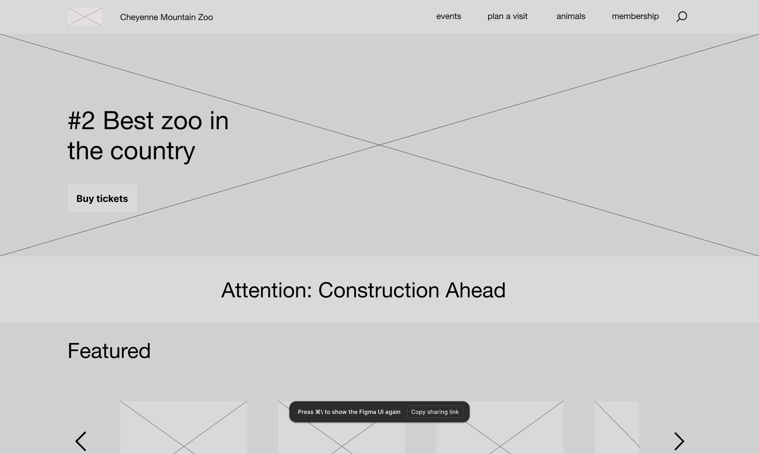
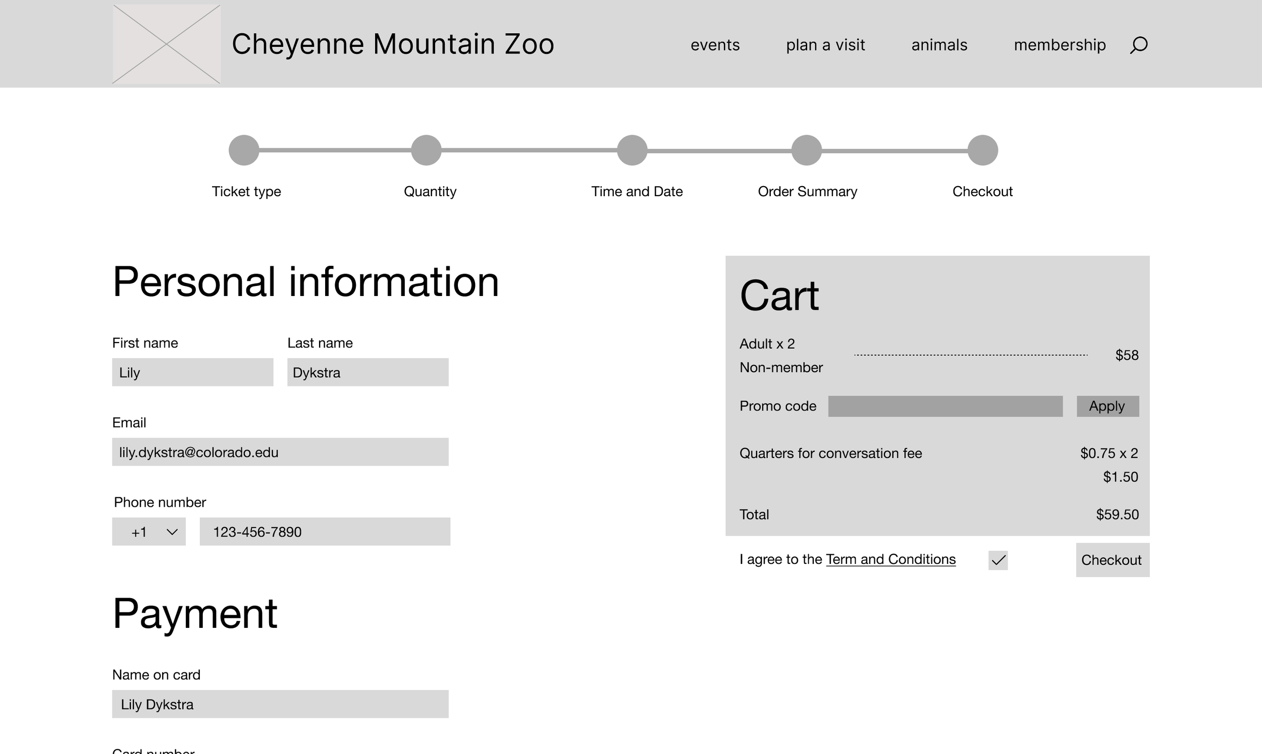
For mid-fidelity I took my low-fidelity and directly translated my sketches into a digital version with a couple changes. The most distinct changes I implemented were adding the header and footer to every page. This allowed me to visualize the final product more clearly and informed my interactive prototype decisions.
Home
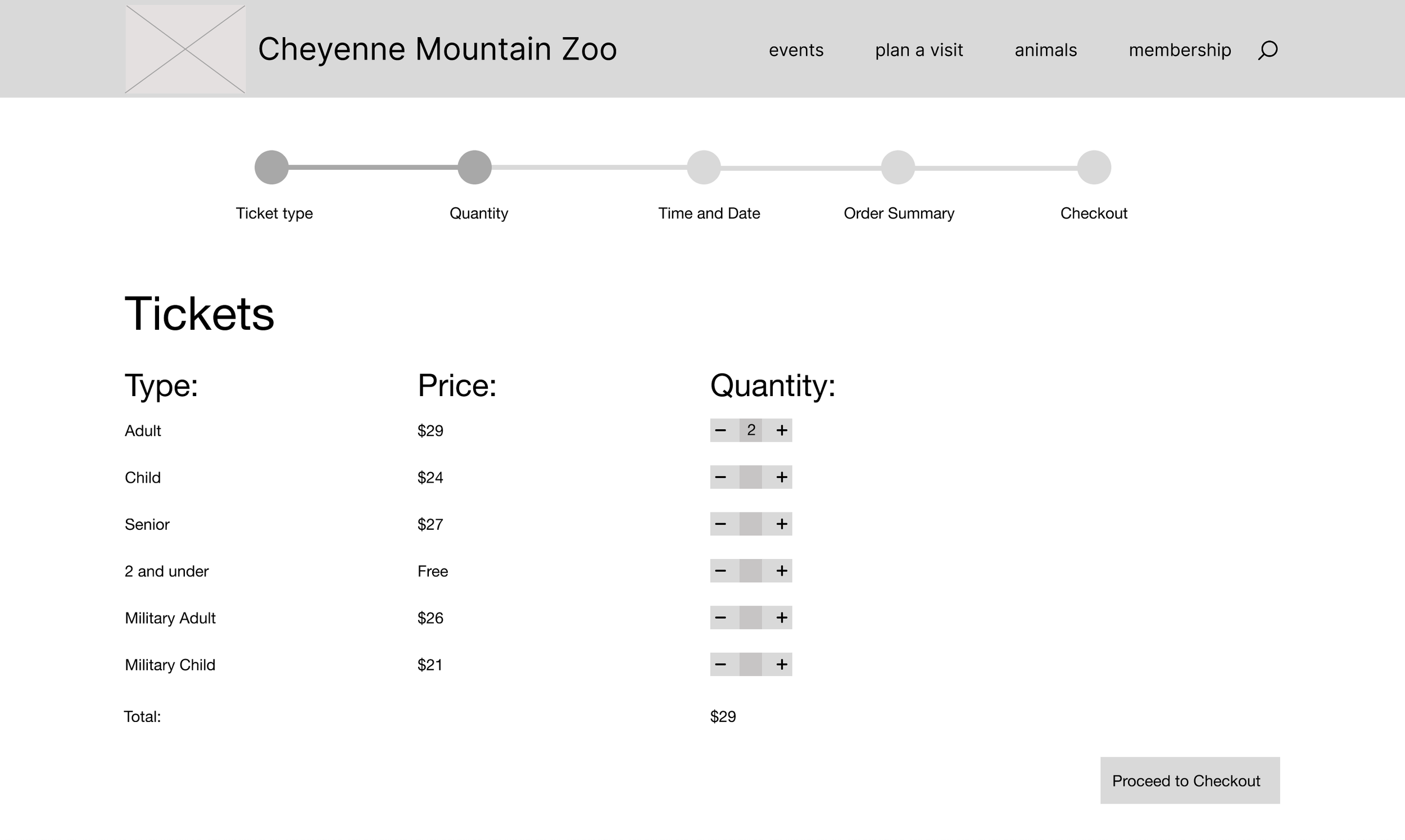
Quantity
Personal information
High fidelity v1 wireframes
Home
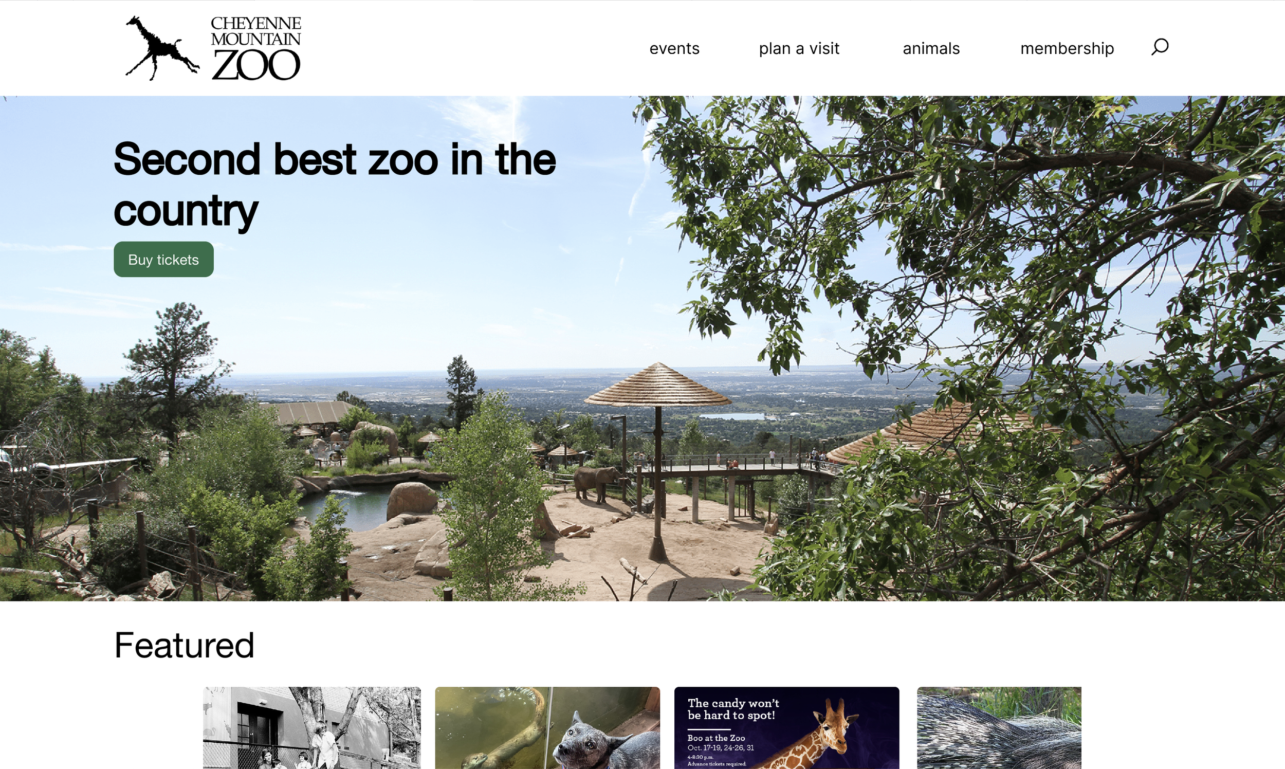
Quantity
Personal information
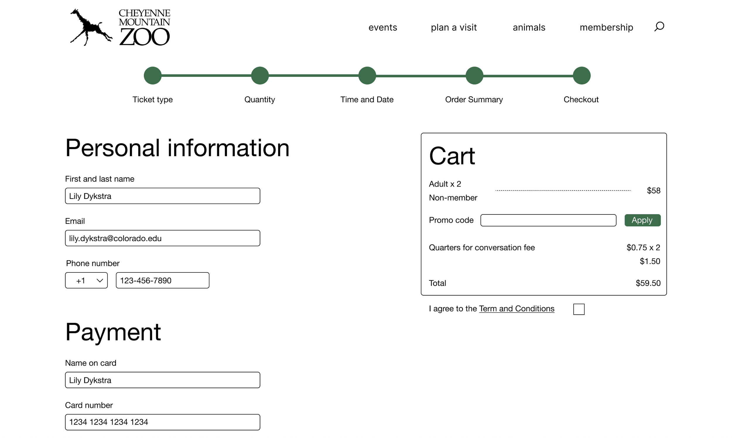
Personal information
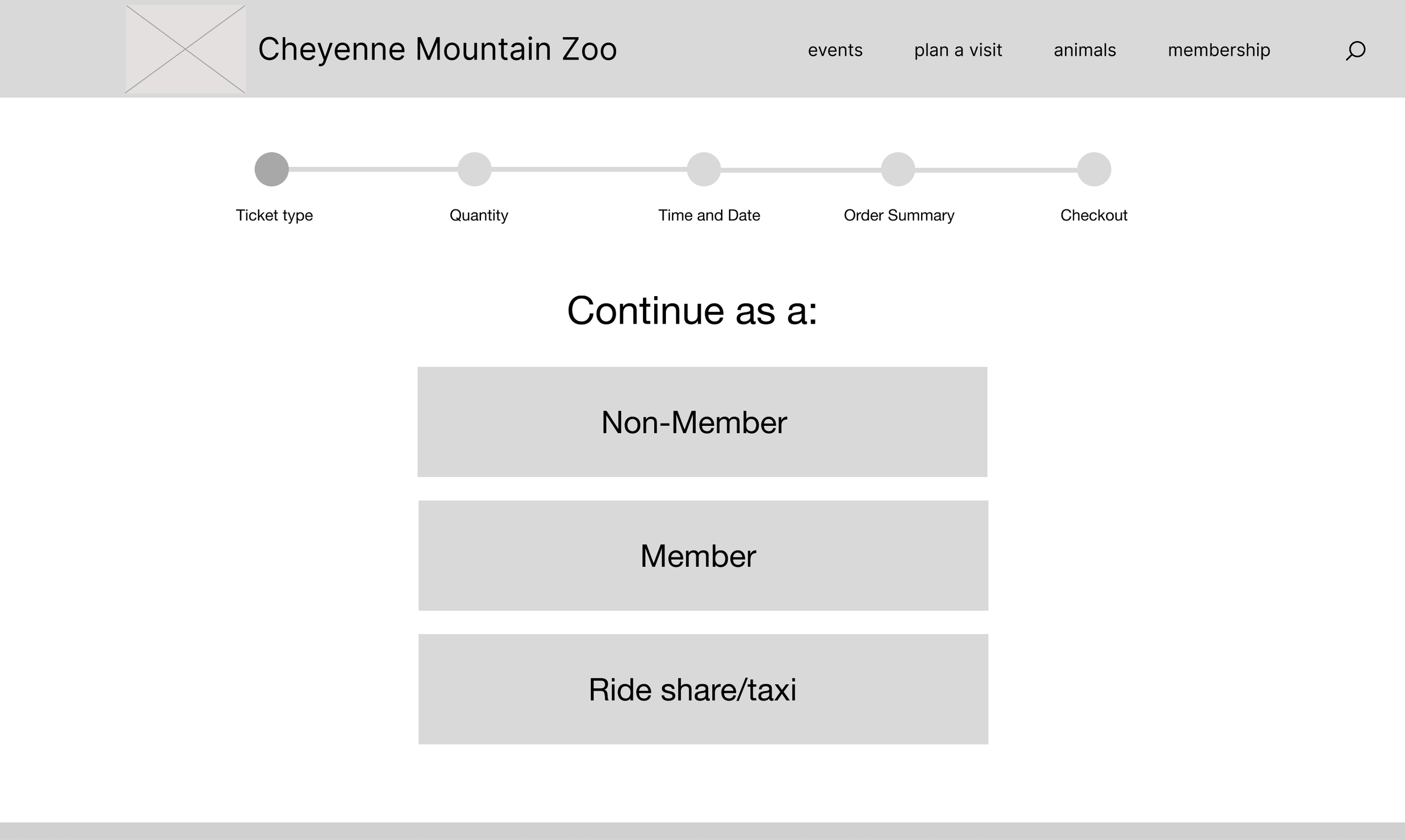
Ticket type
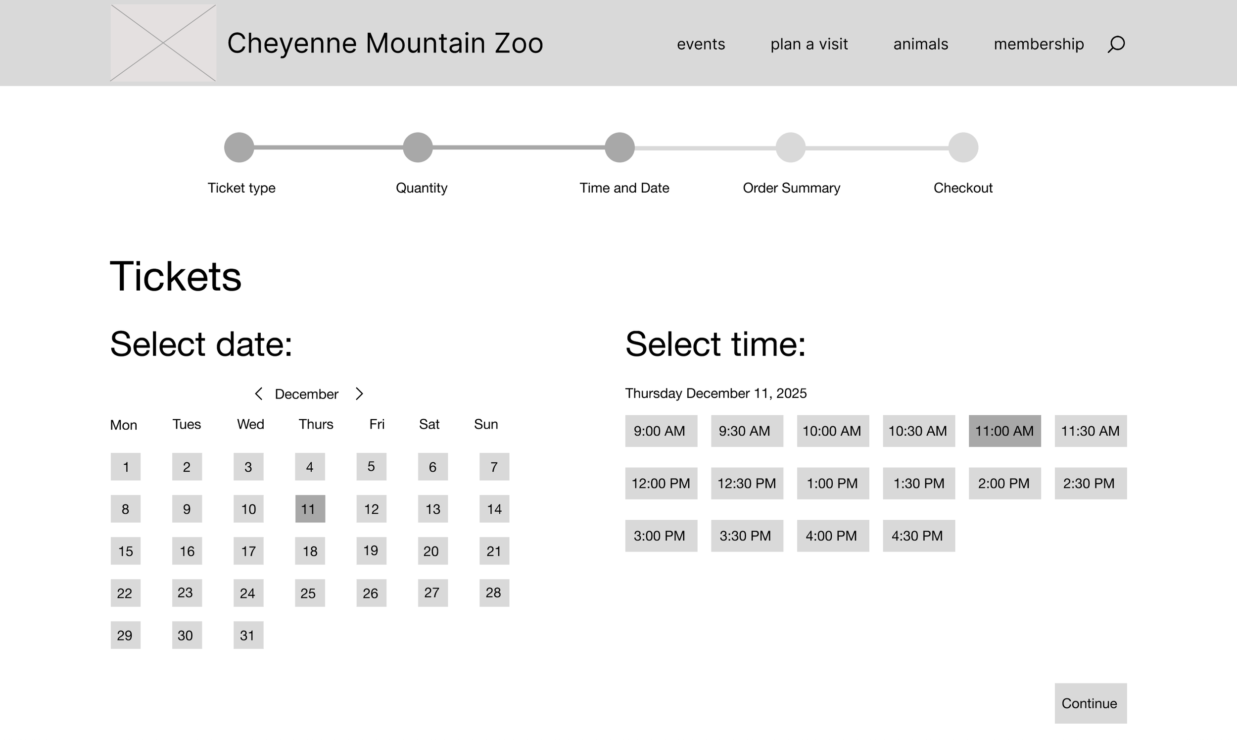
Date and time
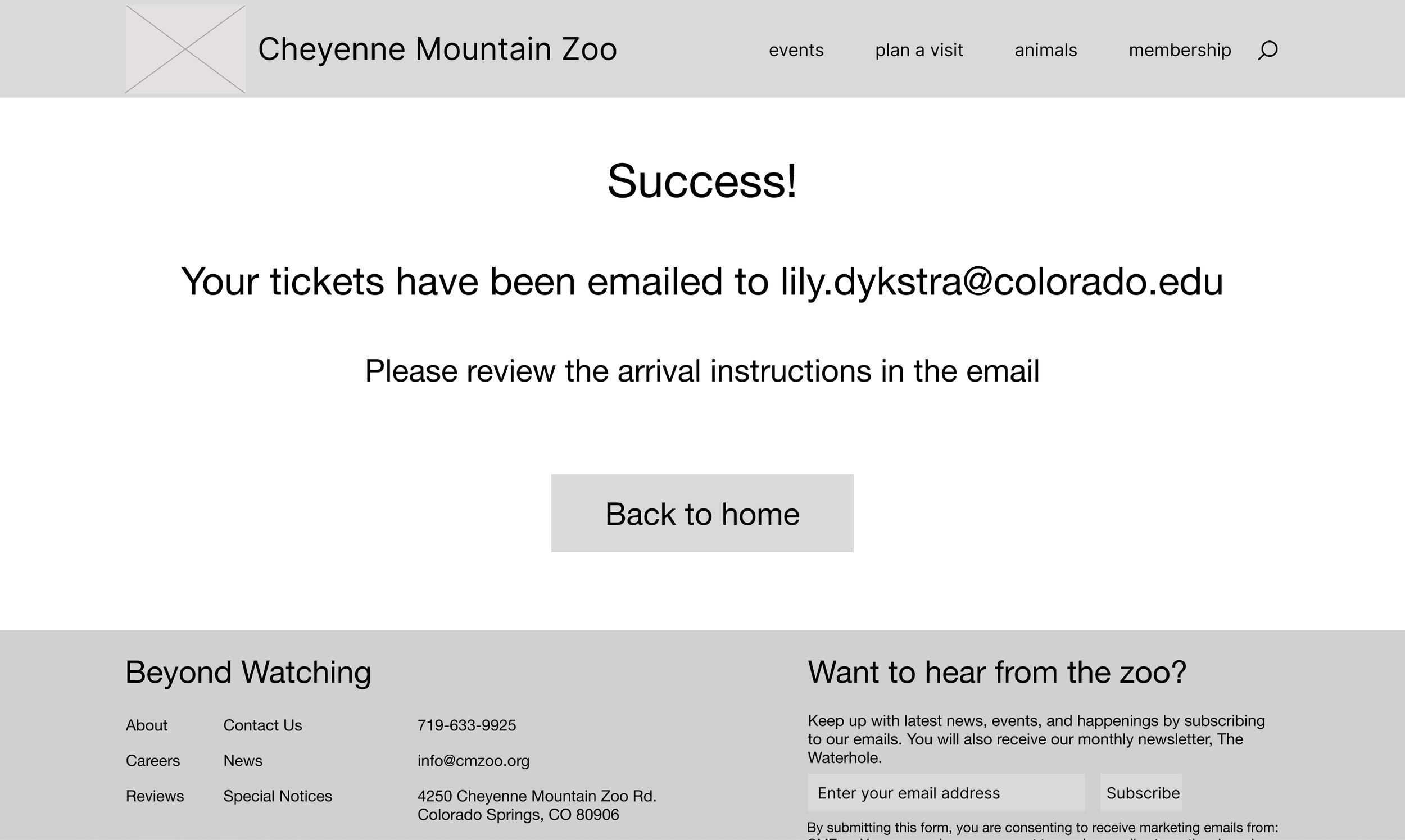
Confirmation
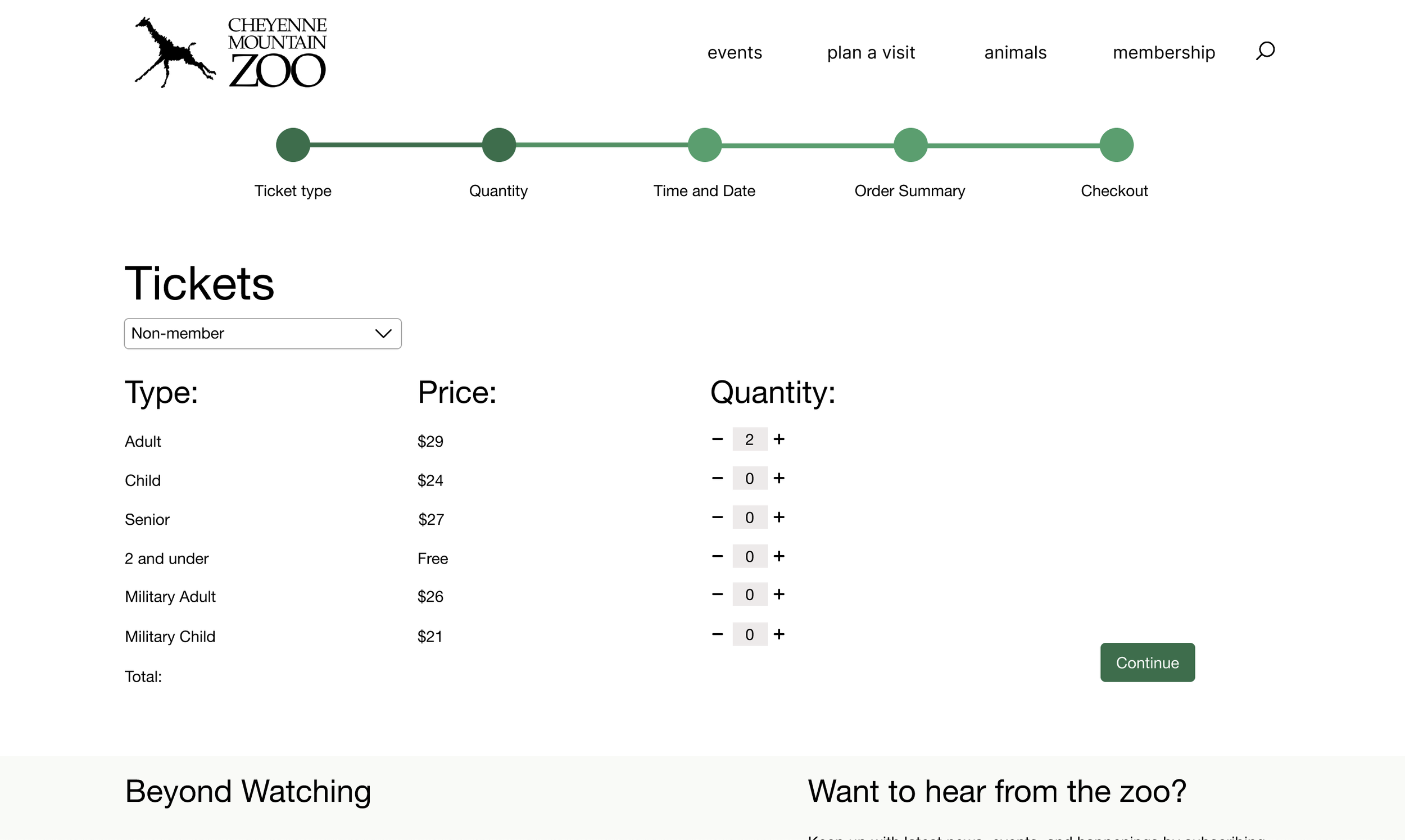
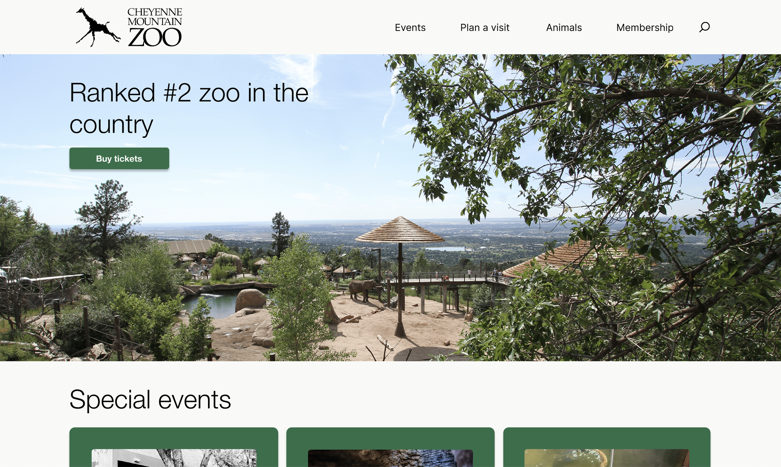
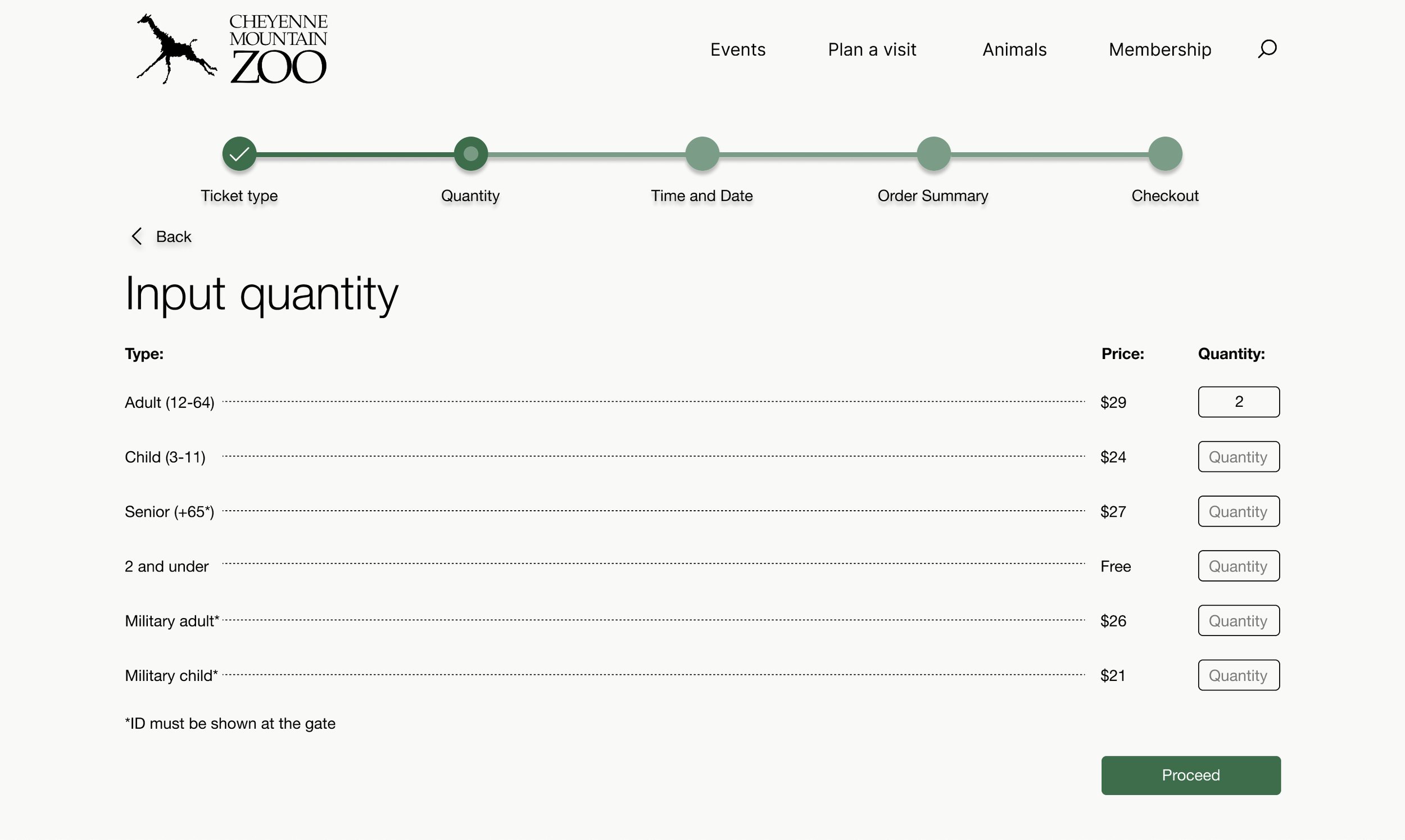
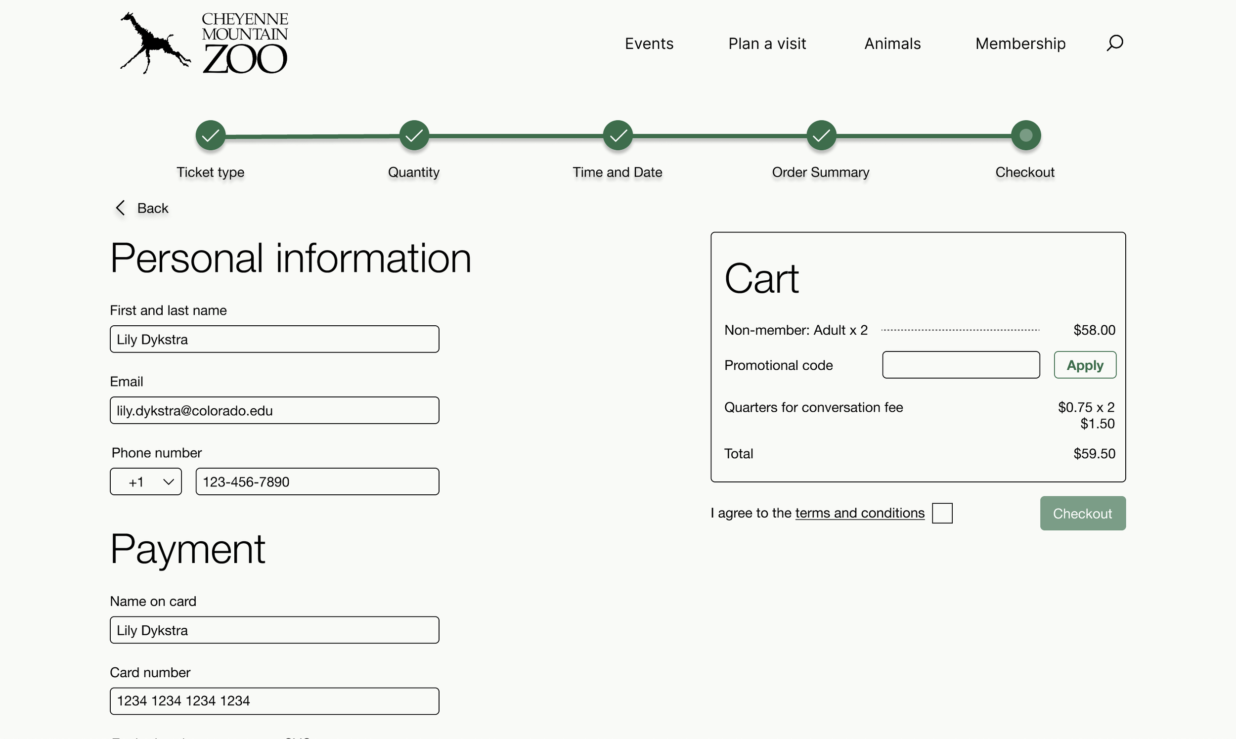
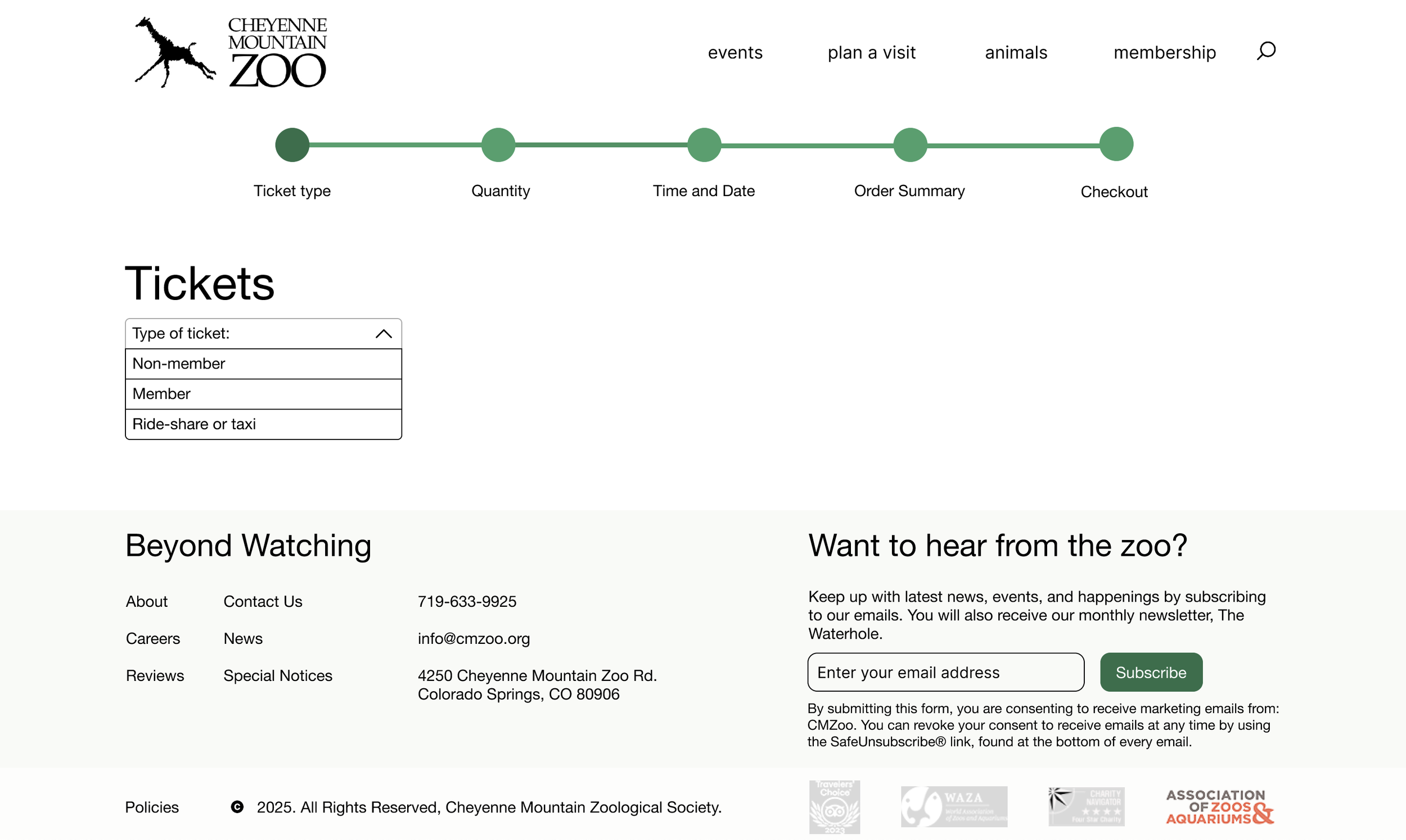
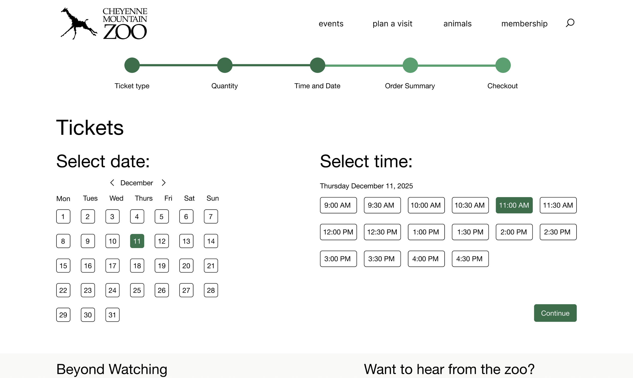
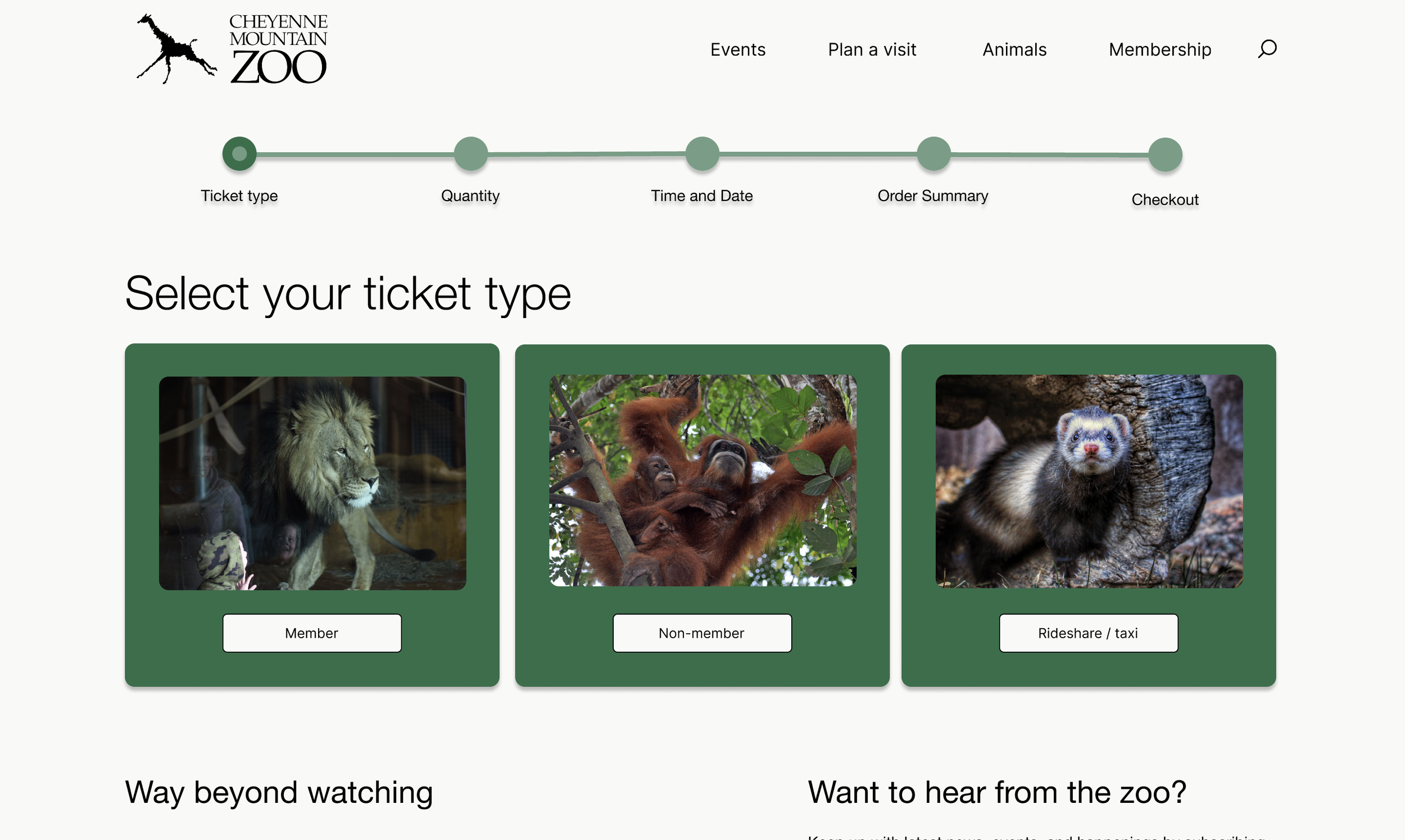
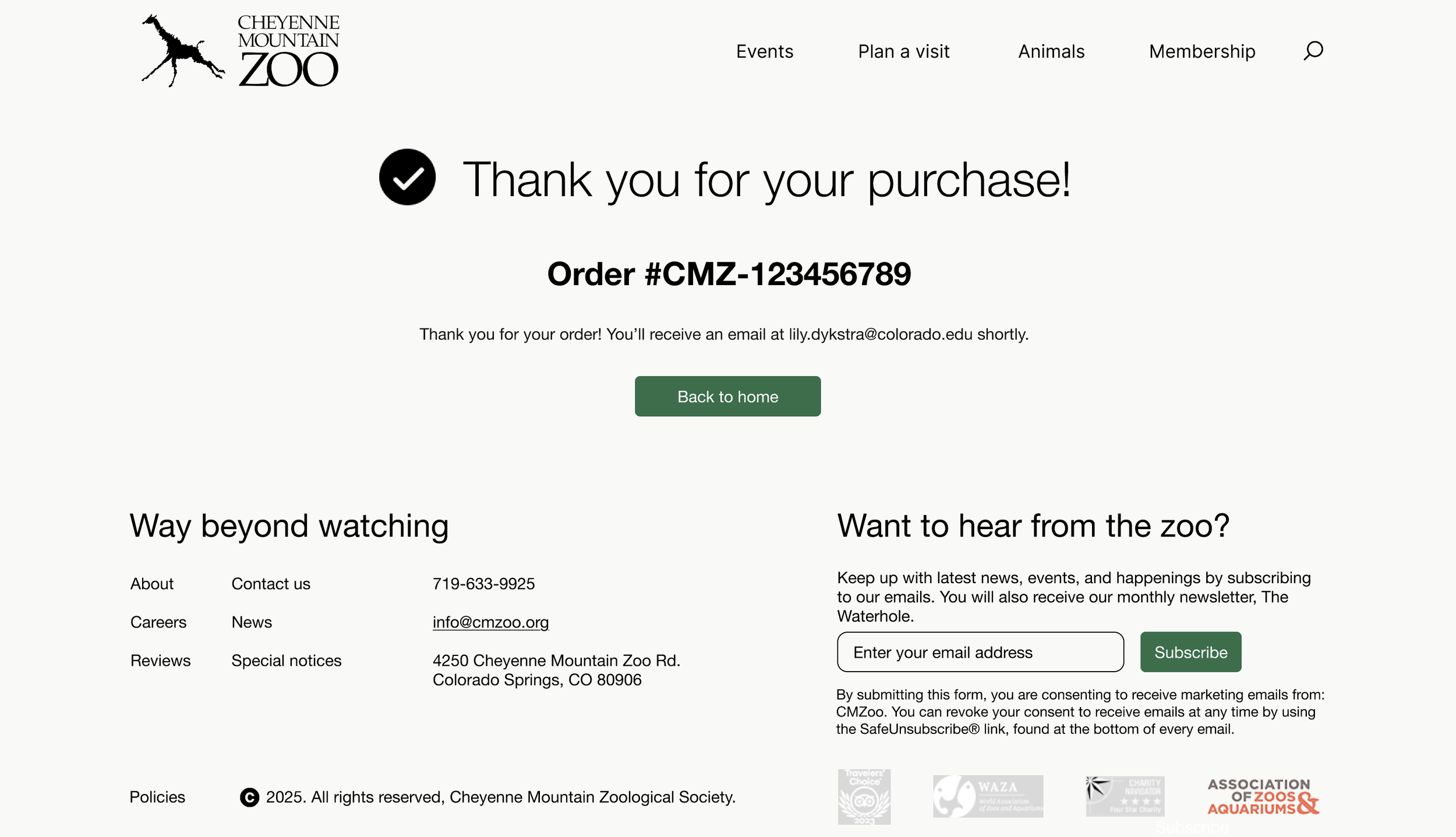
For my last iteration, I implemented the most design changes to date after intensive feedback. I changed my home, ticket type, and quantity screens entirely, fixed my primary and secondary buttons, and finalized all of my spacing. I also fixed color contrast errors in order to make the website as accessible as possible.
For the high fidelity version 1, I added images and color to solidify the overall design. Additionally, interactivity was added via button clicks, hover states, and scrollability. I implemented feedback as the process continued, such as modifying the ticket type selection page.
Home
Quantity
Ticket type
Date and time
High fidelity v2 wireframes and interactive prototype
Instructor feedback
Confirmation
Ticket type
Date and time
Confirmation
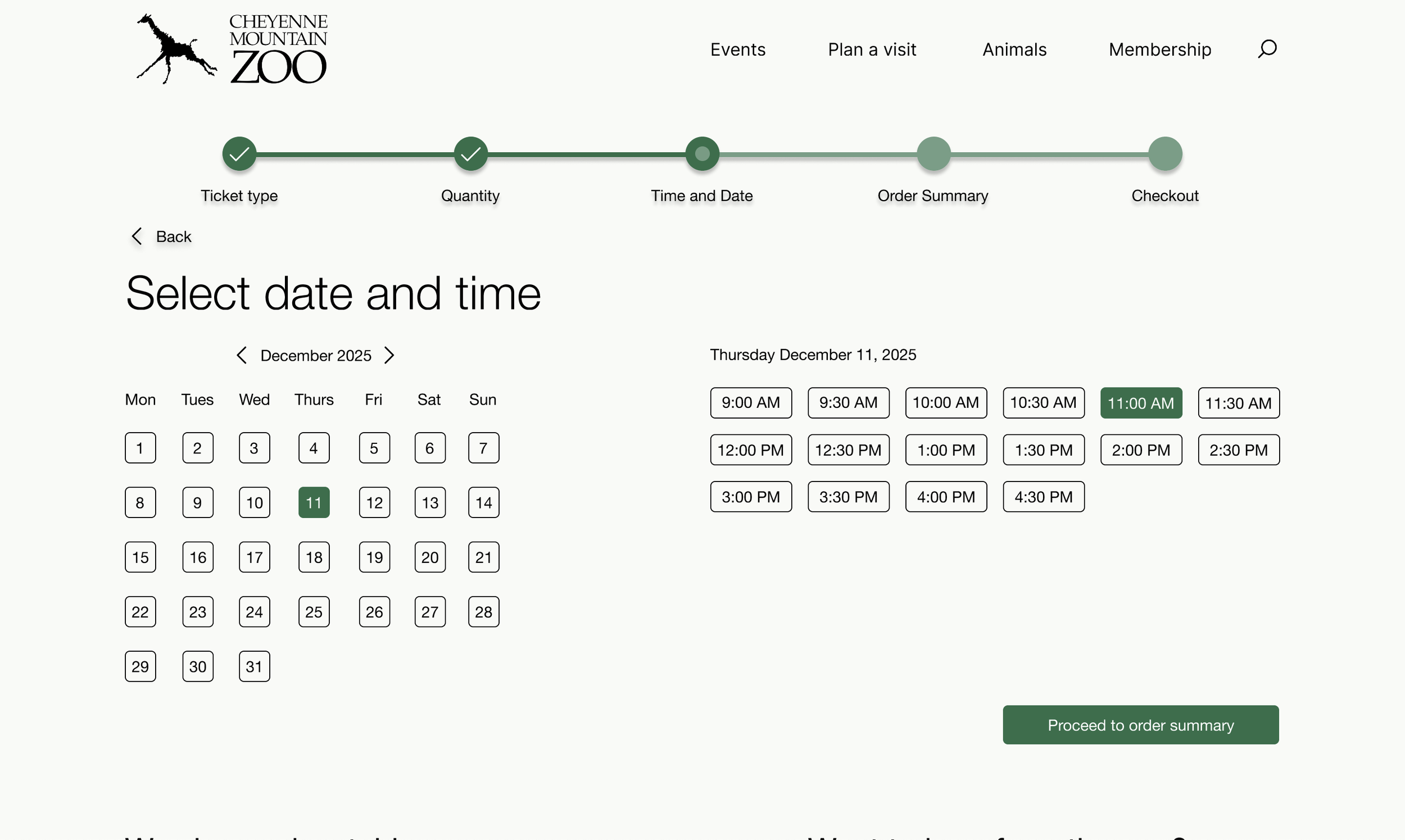
Throughout the design process I received feedback at each iteration. The feedback spanned many different themes. Some examples include, from my low to mid fidelity wireframes, adding a header and footer to every single page as well as changing the page order to have quantity before time and date. A constant problem was fixing spacing errors as any small change to content will throw off the increments of 8 without realizing. I also was able to change color errors like fixing contrast accessibility and the colors distinguishing primary and secondary buttons. I implemented fixes to each feedback comment the best way that I could.
Evaluation and results
User testing process and pain points
My testing process involved finding 3 people to go through my website flow and tell me what they thought. The key pain points discovered were: the schedule layout, ticket type selection, layout of animals page, status bar color contrast, and missing information in the order confirmation page.
Updates
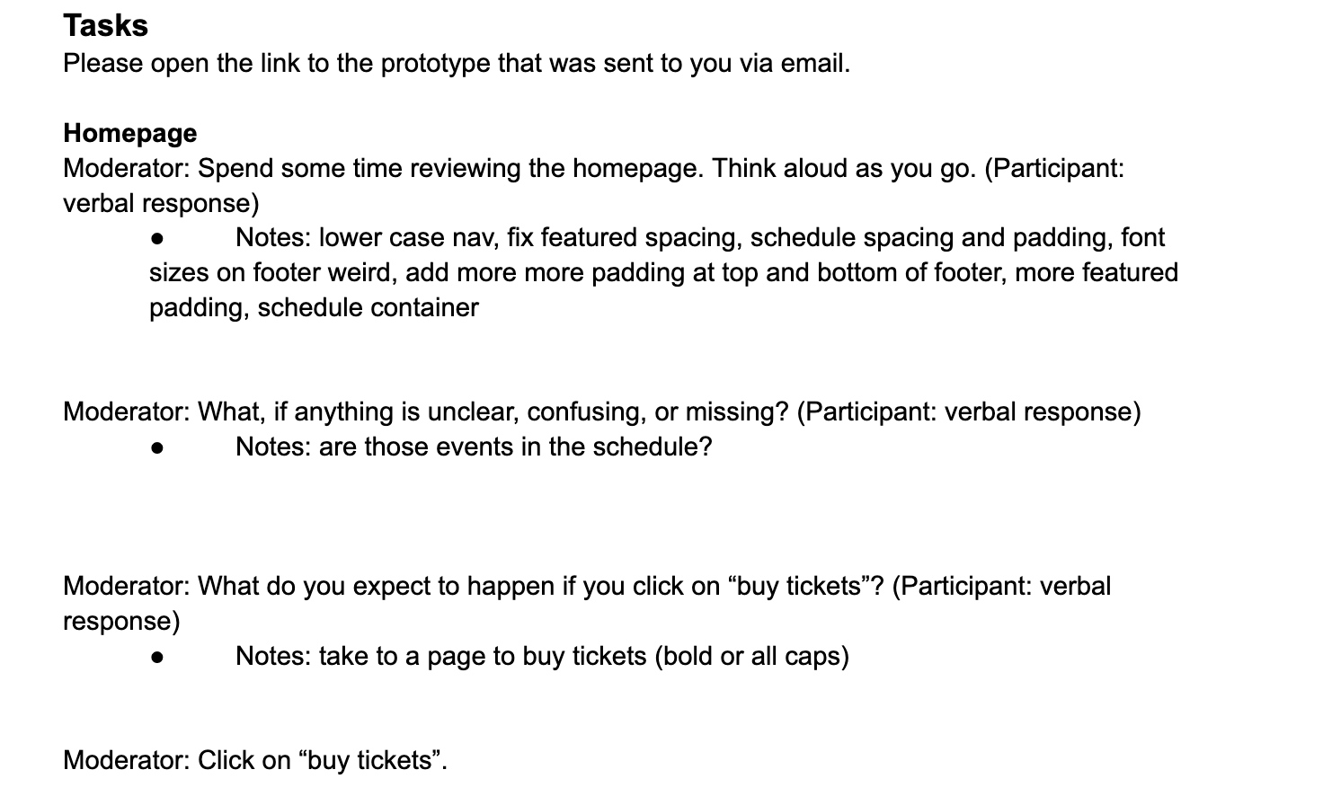

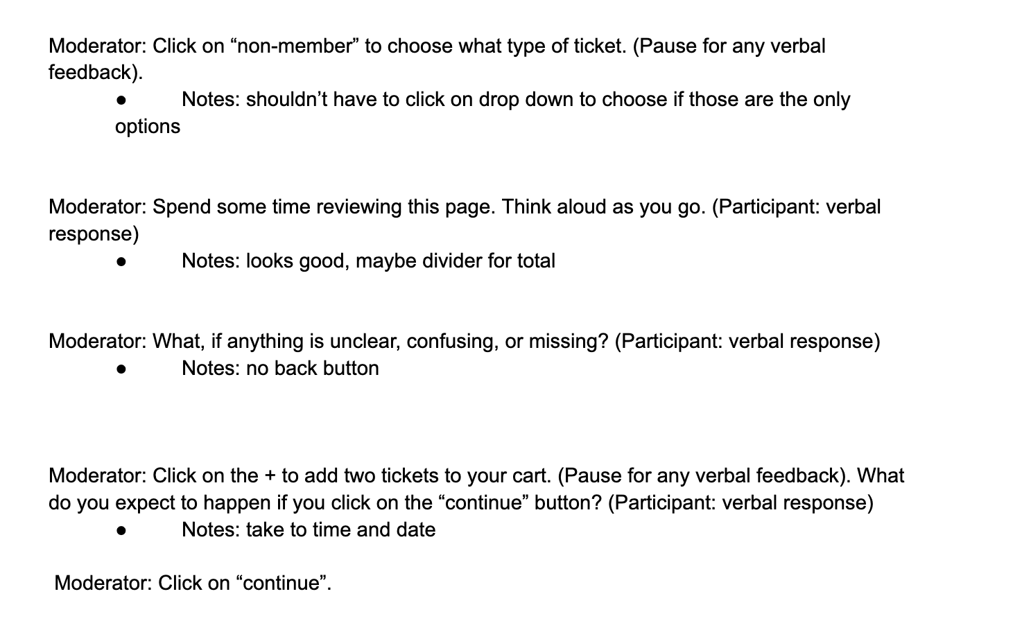
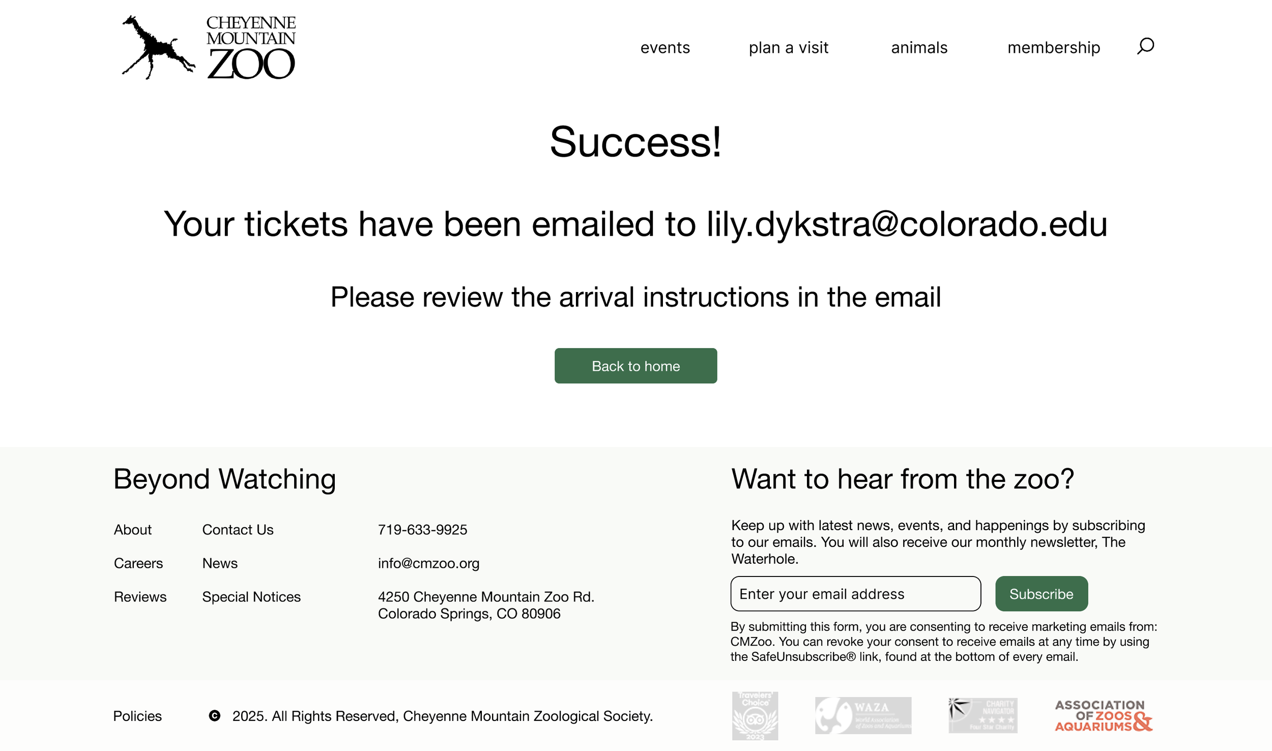
In order to respond to these pain points, I attempted to redesign the schedule layout on the home page, but ultimately gave up and chose different content that was easier to layout. Additionally, I added padding on the animals page, found a different shade with better contrast for the status bar, switched back to my mid fidelity design on ticket type and used buttons, and added information such as an order number to the confirmation page.
Reflection
Future plans
If given more time, I would want to look more into the color scheme of the website. I was unsure about how to add another color so I stuck with a green and a cream, but would love to implement a different secondary color for more depth and eye grab. Additionally, I would love to explore different layouts to best convey information, as graphic design is not a strong suit of mine, I was insecure about a lot of the design and played it safe. Overall, I think I would just explore different opportunities more and implement via A/B testing to really experiment with what users want.
Conclusion
My key takeaways from this project are all the UX knowledge and feedback I was given. I had no idea how much went into creating a readable and welcoming website. I was able to iterate and learn so much as time went on. I came into this wanting to learn about how to improve user experience on a larger scale as I am interested in physical design. However, this project taught me how much I enjoy the digital aspects as well. On a more specific note, from an interaction perspective, it was eye opening to see what users gravitate towards and how the way I set up interactions dictated exactly what the user would do. Overall, I greatly enjoyed this project and will be taking everything I learned to different projects.